
Manufacturing choices
Choose the process around the finished product.
Our printing factory combines offset and digital printing, binding, finishing and assembly. Start with what the product must do, then choose the stock and production route that support it.
Offset or digital: compare the whole job.
Setup cost is only one part of the decision. Print area, stock, quantity, color requirements and the finishing route all affect the suitable method.
| Method | Useful for | Check before selection |
|---|---|---|
| Sheetfed offset | Repeated copies of the same artwork; full-color imagery or specified spot inks | Plate setup, sheet size, chosen stock and the finished color reference |
| Digital printing | Shorter runs, changing artwork or variable content where the selected system supports it | Sheet and stock compatibility, available color route and differences from an offset sample |
| Variable data | Numbers, codes or individualized content linked to a master design | Data fields, first/last values, missing or duplicate records and scan behavior |
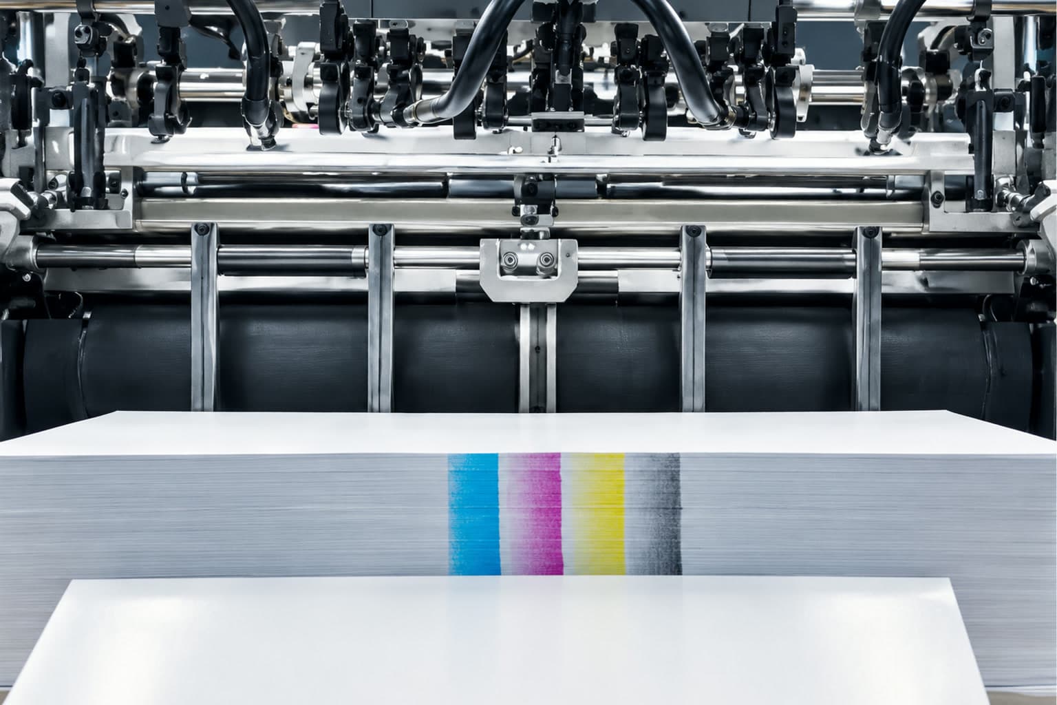
A lower quantity does not automatically make digital the right choice, and one universal quantity threshold cannot cover every format. Compare quotations against the same stock, print area and finish.
Material selector
Four paper families. Different jobs.
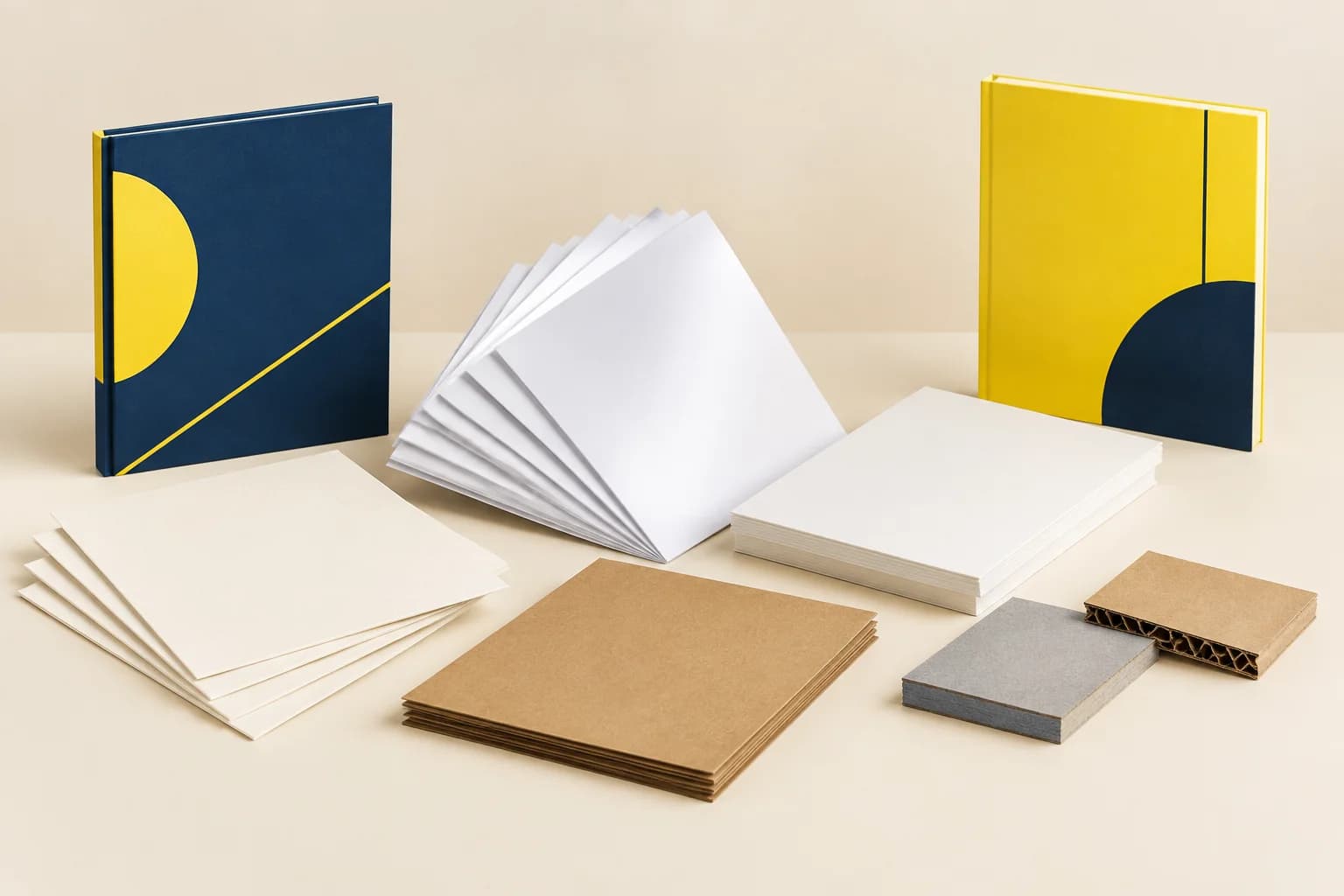
Coated art paper, woodfree uncoated paper, white card and specialty paper are our regular material families. Select the actual grade by surface, opacity, thickness and construction—not by a vague quality label.
Coated art paper: Detail and a smoother image surface
The coating gives ink a more even surface for photographs and fine illustrations. Gloss emphasizes reflections; a matte-coated surface reduces glare. Coated paper is different from adding a film laminate after printing.
Use for image-led books, brochures and printed wraps. Check folds on heavier grades and compare a finished sample when dark coverage crosses a crease.
115 / 150 / 170 g/m² are published Sappi Magno Satin examples for comparison, not a statement of local inventory.
Woodfree uncoated paper: A writable, low-glare surface
Without a coated image surface, ink interacts more with the sheet. The natural surface suits handwriting and text-led reading; photographs may appear less saturated than on coated stock.
Use for workbooks, manuals and text interiors. Compare printed opacity and writing tools rather than choosing only by weight. Woodfree describes papermaking composition, not tree-free paper.
Record g/m², caliper in μm and printed opacity for the actual grade; equal g/m² does not mean equal thickness.
White card: A print surface with structural stiffness
A white print face suits cards, covers and carton graphics. One-side and two-side coated grades serve different inside and outside surfaces; stiffness and crease behavior depend on the grade and grain direction.
Use for cards, covers and folding cartons. Match the coating side to the artwork and test a scored fold before selecting the board for a packed item.
300 / 350 g/m² are published Fedrigoni Symbol Card 2SC examples. They do not specify dark-core opacity or a carton strength rating.
Specialty paper: Texture becomes part of the design
Textured, colored and other specialty sheets change both handling and printed appearance. The unprinted base color remains part of the result, while a textured face can interrupt very fine foil or small printed detail.
Use for cover wraps, invitations and presentation details. Compare the intended ink, adhesive and finish on the actual sheet; a screen texture cannot approve a tactile result.
Specify the exact grade, color, g/m² and caliper. Recycled-content or certified-material claims need order-specific documentation.
Opening behavior starts with construction.
| Route | Use and behavior | Design consequence |
|---|---|---|
| Saddle stitch | Folded sections held through the center fold; compact booklets | Page count normally works in multiples of four; allow for creep and the folded trim |
| Perfect binding | A glued spine creates a square-backed paperback | Keep critical content away from the binding edge; stock, adhesive and block thickness affect opening |
| Sewn case binding | Gathered sections enclosed in a hard case | The case, hinges and spine are separate parts; a hardcover alone does not guarantee lay-flat opening |
| Spiral / Wire-O | Punched leaves turn around a coil or paired wire loops | Reserve the punching area and choose the binding diameter around the complete finished stack |
| Folding and die cutting | Converted panels, slots and outlines for cartons or display pieces | Use the approved vector template and check folds, grain direction, fit and finishing clearances |
A cover finish, a spine width and a binding method are connected choices. Use a bound or structural sample when opening, fit or handling matters.
Define the color target before converting artwork.
CMYK builds images from process inks. A Pantone reference identifies a target color; it does not automatically mean that color is printed with a separate spot ink.
Paper color, surface and the final coating affect appearance. Keep one named output condition and an appropriate approval reference in the job specification; no single color-tolerance number describes every stock and finish.
| Decision | Specify | Verify |
|---|---|---|
| CMYK images | Agreed ICC output condition | Tonal detail, neutral balance and the intended stock |
| Spot ink or simulation | Current coated/uncoated PMS reference and ink route | Physical target on the actual print surface |
| Color-critical areas | Named approval sample and evaluation conditions | Finished appearance after the included laminate or coating |
An effect must work on its substrate.
Hot foil stamping
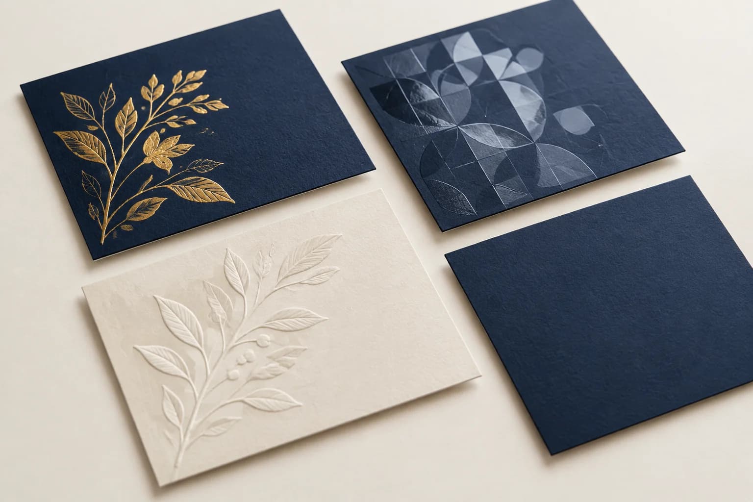
Heat and pressure transfer a foil layer from a carrier onto the surface. Reflective detail makes a mark stand out, but fine lines, textured stock and nearby folds need a sample check.
Spot UV and relief
Selective varnish adds gloss contrast; embossing or debossing shapes the material with a tool. Both need separate artwork and clearance from sensitive edges, folds and binding.
Lamination
A bonded film changes reflection and touch. Matte, gloss and soft-touch finishes are surface choices; none alone proves scratch or moisture resistance. Check adhesion and rubbing on representative dark coverage.
Build a specification we can quote.
Describe the product, material, quantity and effects you are comparing. Free samples are available, with preparation completed within 15 days; identify what the sample needs to verify.