The finishing library
Print surface finishes.
A different impression.
Reflection, texture and touch. Compare the finishing choices that shape your books, cards and packaging—then specify the effect your product needs.
Explore nine finishesVisual studies by Lemon Printing. Approve the final effect on the selected material.
01 / Surface
Varnish & coating
An even layer of sheen
A clear coating changes the reflection of printed ink without adding a separate film. Gloss varnish catches the light across the sheet; the coating route and stock determine the final appearance.
- How it works
- Applied as a liquid over the printed surface, then dried or cured using the selected coating system. Specify whether you need a flood coating or selected coverage.
- Where it fits
- Brochures, printed covers and folding cartons where an overall sheen supports the design.
- What to check
- Coatings can shift color and still show scuffs. Confirm the coating chemistry, ink compatibility, fold behavior and rub performance on the actual stock.
- Artwork setup
- Confirm the coated side and coverage. Mark glue areas and other locations that must remain clear; provide a separate mask for selective coverage.
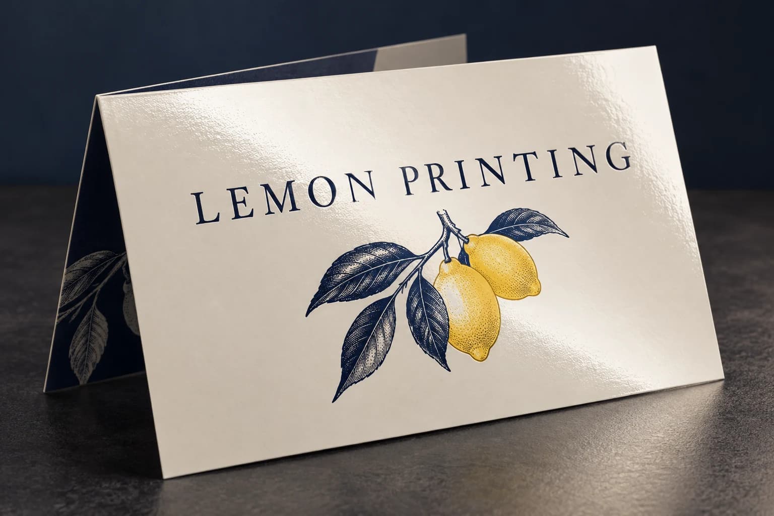
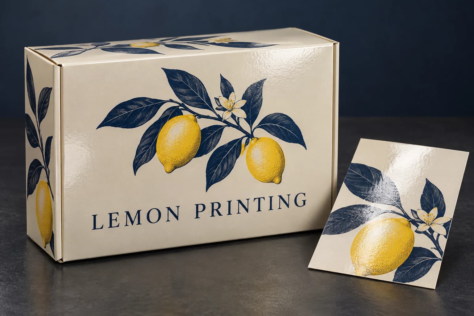
1 / 3 — Gloss-coated brochure with an even reflected highlight. Illustrative, not an actual order or performance test.
02 / Surface
No added surface treatment
Let the paper surface lead
Keep the printed sheet without added varnish, film, foil or relief. The stock itself controls the feel: an uncoated sheet is tactile and absorbent, while an untreated coated sheet can still have a smooth sheen.
- How it works
- Print on the selected paper and omit additional surface finishing. “No treatment” describes the post-print route; it does not mean the paper must be uncoated.
- Where it fits
- Writing areas, understated stationery and designs that emphasize paper texture.
- What to check
- Exposed ink can rub or mark during handling. Check ink drying, dark coverage and whether the selected surface accepts the intended pen or pencil.
- Artwork setup
- Identify any writing area and the exact stock. Approve color on that surface rather than expecting an uncoated paper to reproduce a coated-paper sample.
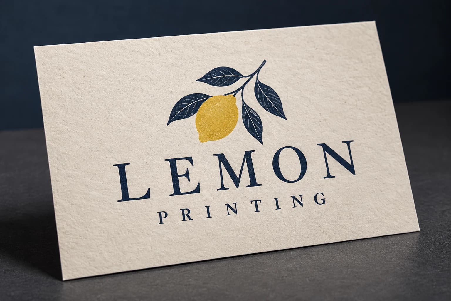
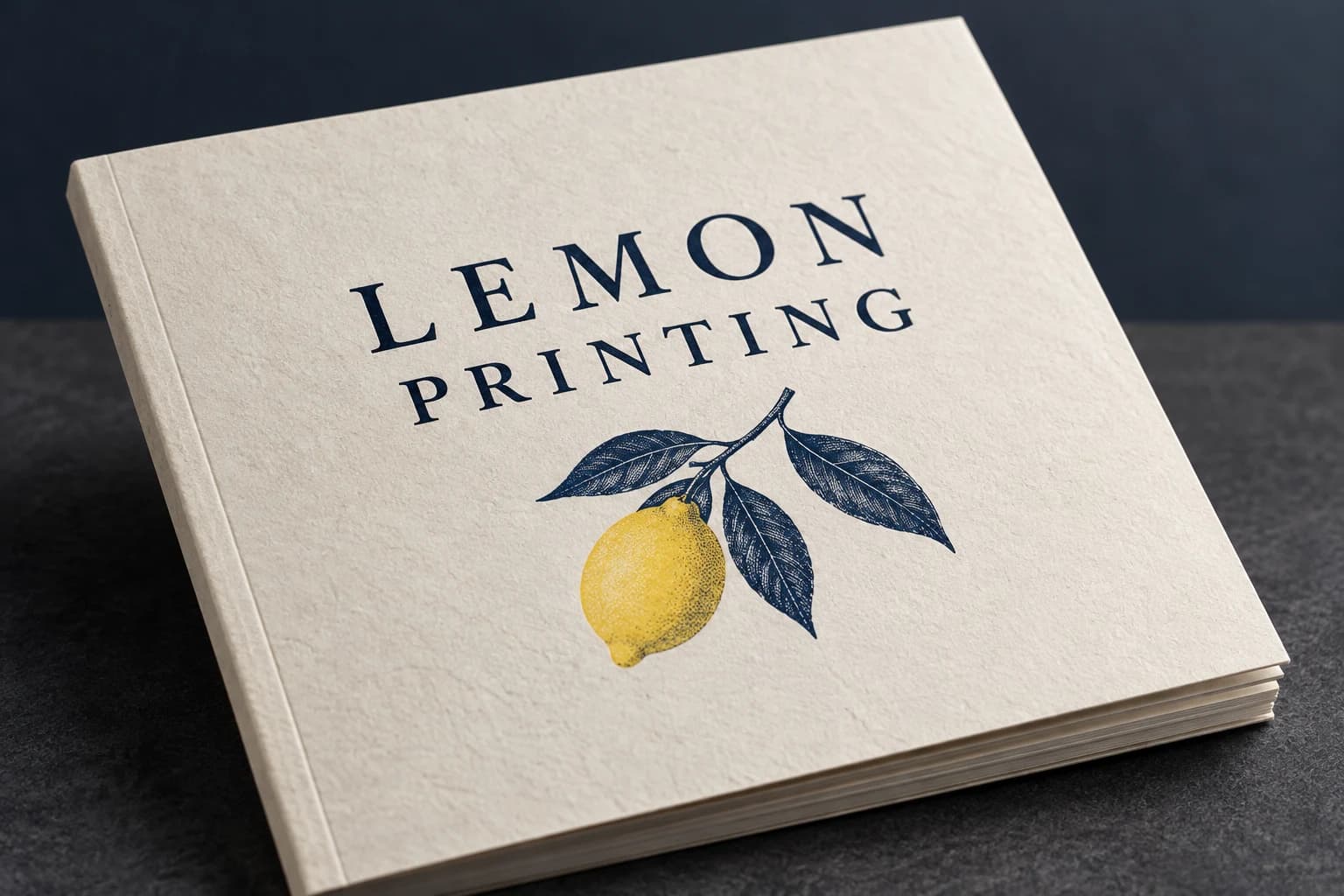
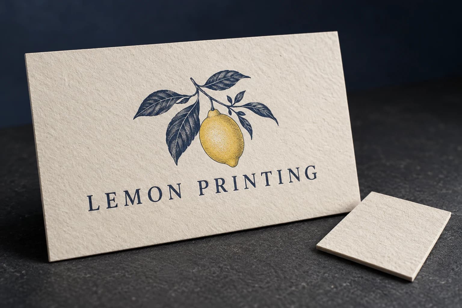
1 / 3 — Uncoated printed stationery with visible natural paper fibers. Illustrative, not an actual order or performance test.
03 / Film
Gloss lamination
Bright reflections. Vivid contrast.
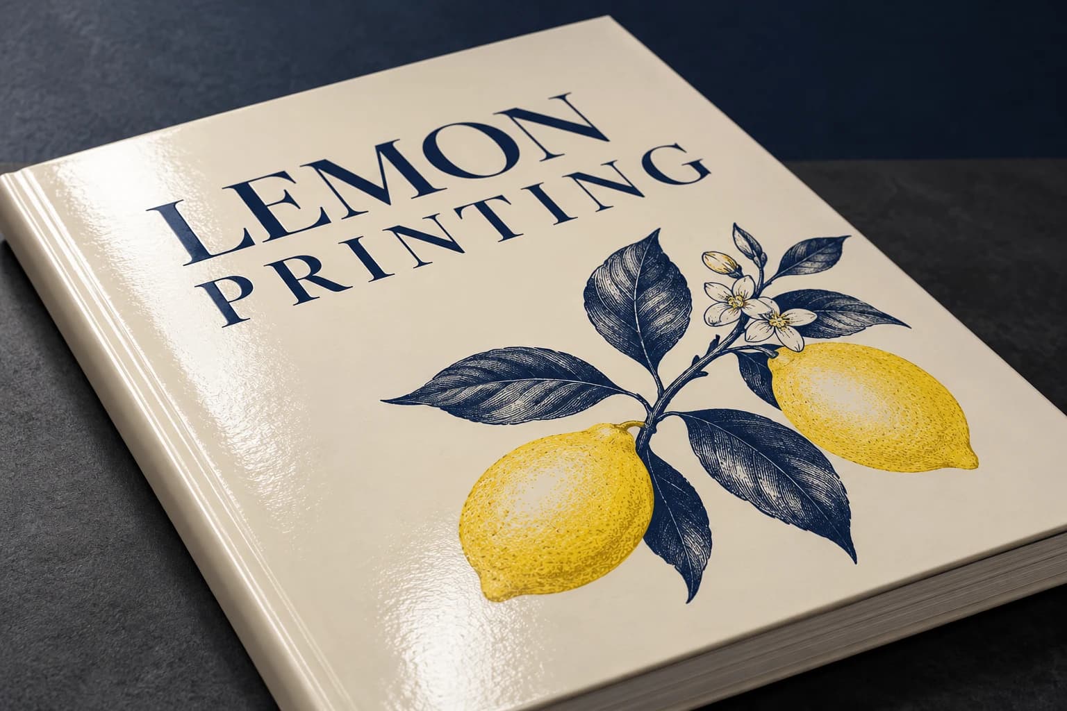
A clear glossy film creates a smooth, reflective surface over the print. It can make dark coverage and saturated imagery look more vivid, especially when the product is tilted toward the light.
- How it works
- Bond a transparent gloss film to the printed sheet using an appropriate adhesive and lamination route. Film, ink and paper must work together.
- Where it fits
- Illustrated book covers, promotional cards and packaging with bold graphics.
- What to check
- Gloss reflects overhead light and can reveal fingerprints or fine scratches. Check adhesion, edge lift and any creases; a laminated sheet is not automatically waterproof.
- Artwork setup
- State which side is laminated. Review foil or spot coating compatibility if adding another finish, and keep production fold and glue areas in the specification.
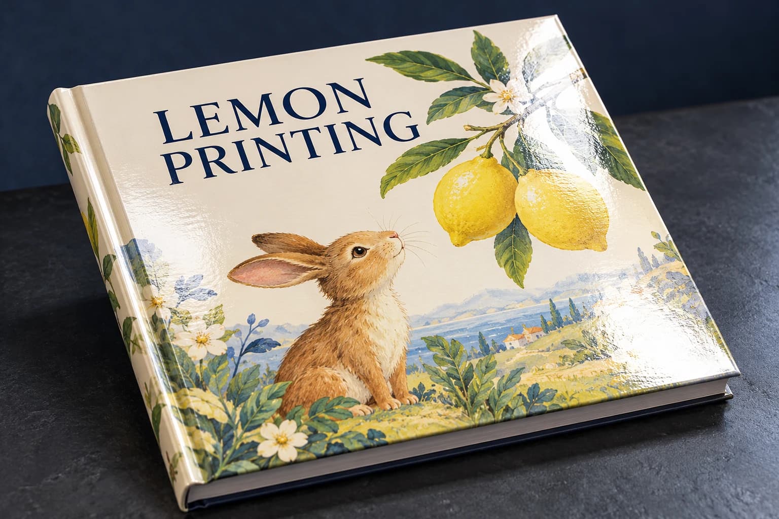
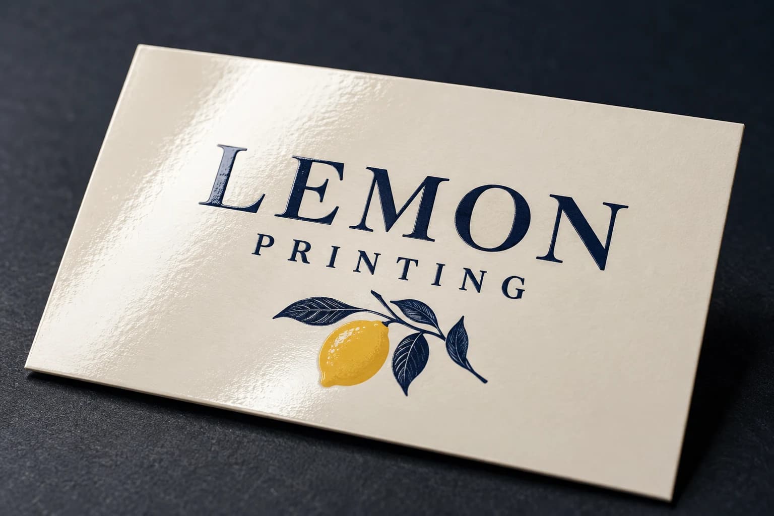
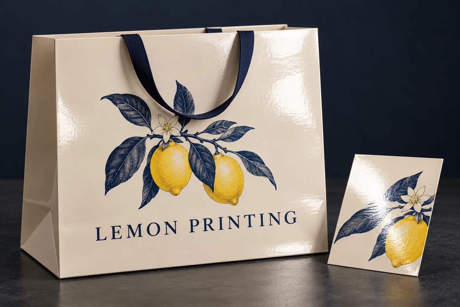
1 / 3 — Gloss-laminated illustrated book cover with a broad specular reflection. Illustrative, not an actual order or performance test.
04 / Film
Matte lamination
Soft reflection. Quiet color.
Matte film softens reflection and gives a restrained, smooth finish. It is a different surface choice from soft-touch film; a matte appearance alone does not promise a velvety feel or scratch resistance.
- How it works
- Bond a matte film over the print. Select the film grade around handling, color appearance and any subsequent foil or spot UV process.
- Where it fits
- Hardcover books, presentation pieces and retail packaging where low glare supports the artwork.
- What to check
- Dark solids can reveal rub marks. Compare finished swatches, check crease and edge adhesion, and request a specific anti-scuff grade only when the project requires it.
- Artwork setup
- Confirm laminated sides and subsequent finishes. Review final color after lamination, because a print-only proof cannot represent the finished surface.
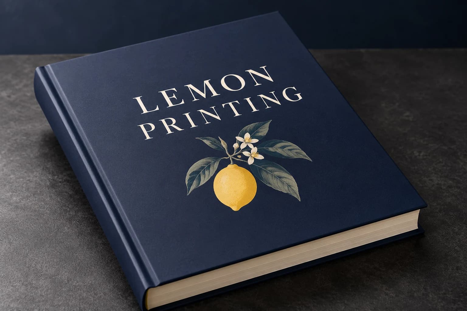
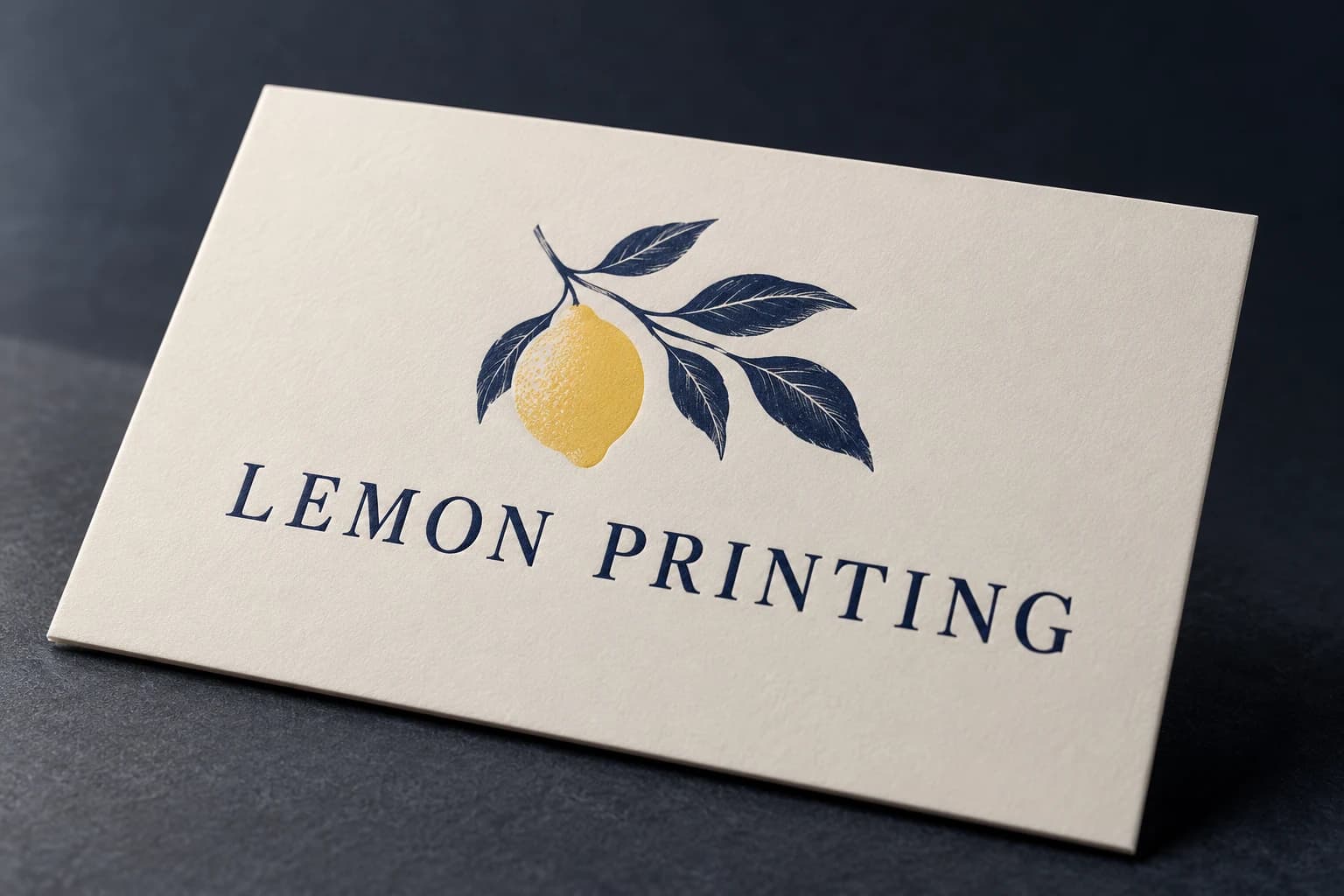
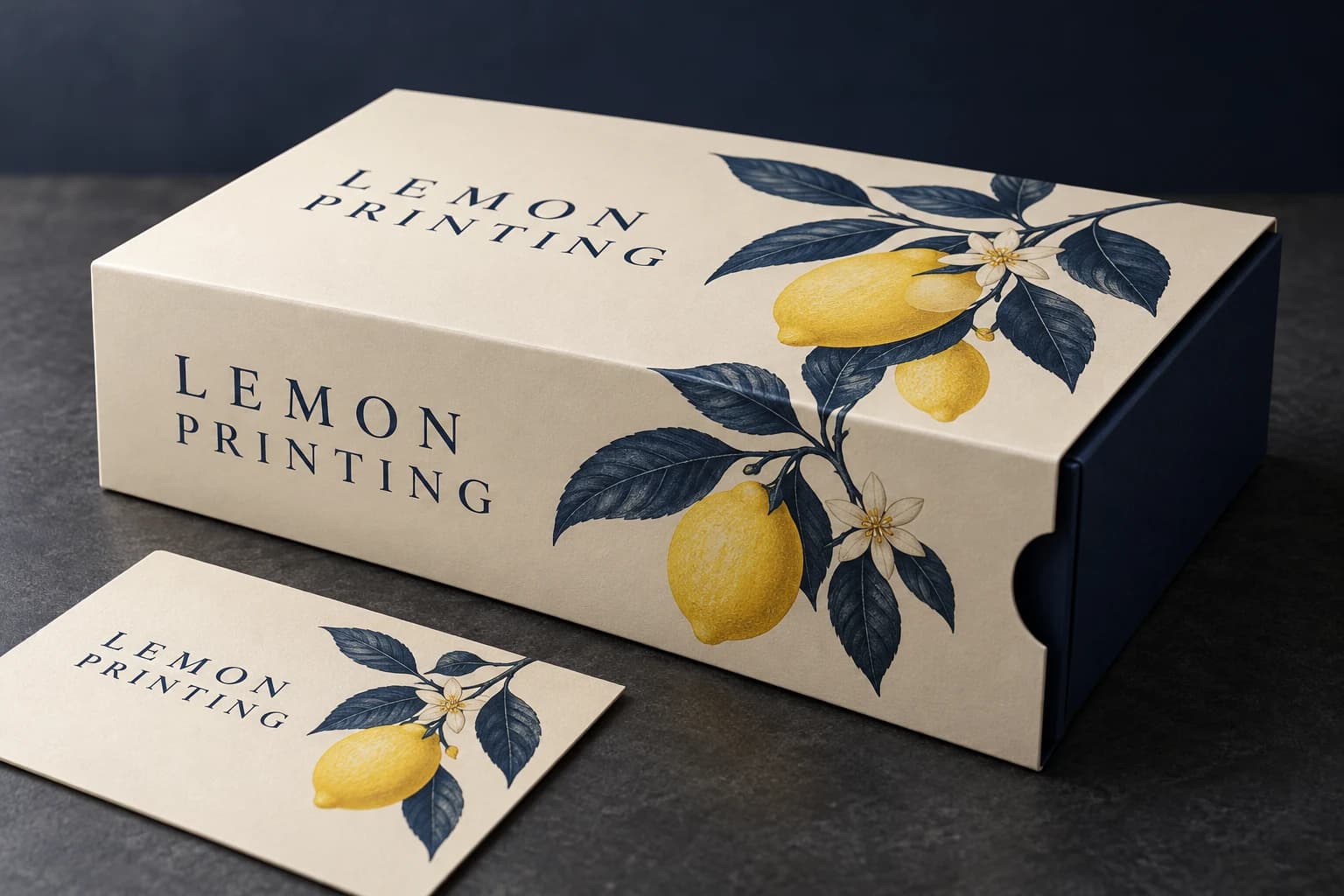
1 / 3 — Matte-laminated navy hardcover with diffuse low-glare reflection. Illustrative, not an actual order or performance test.
05 / Metallic
Gold foil stamping
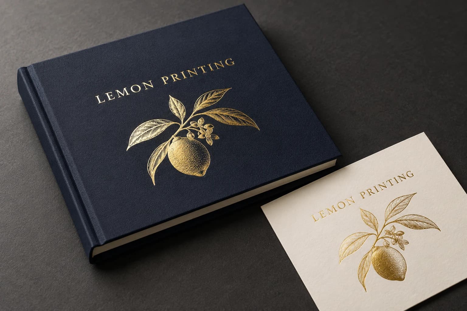
A warm metallic focal point
Gold foil produces a reflective metallic detail that process ink cannot reproduce. The foil shade, stock and viewing angle all influence whether the effect feels bright, warm or subdued.
- How it works
- A heated stamping die and pressure transfer a decorative foil layer onto the surface. Flat foil is separate from embossing; a raised metallic effect requires an agreed combined route.
- Where it fits
- Book titles, brand marks, invitations and packaging accents.
- What to check
- Fine lines, tiny reversed text and rough stock can lose clarity. Check foil adhesion, complete transfer and registration with the printed artwork using a representative sample.
- Artwork setup
- Supply a separate vector foil layer at final size, using solid shapes. Confirm the foil reference, minimum detail and clearances from trim, hinges, folds and punched areas.
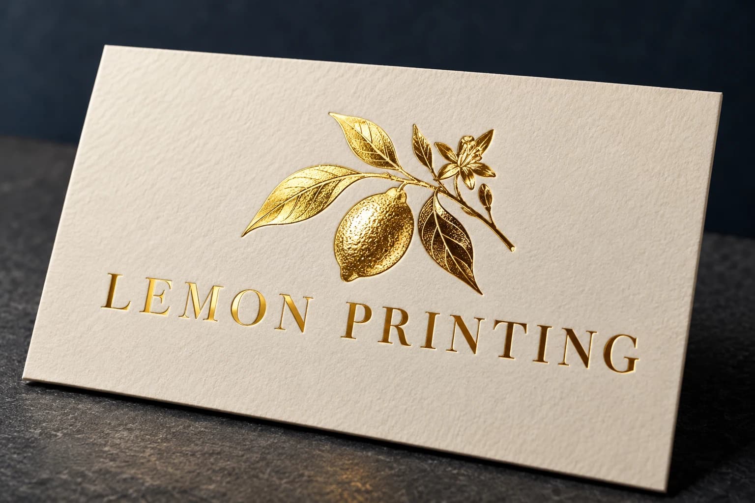
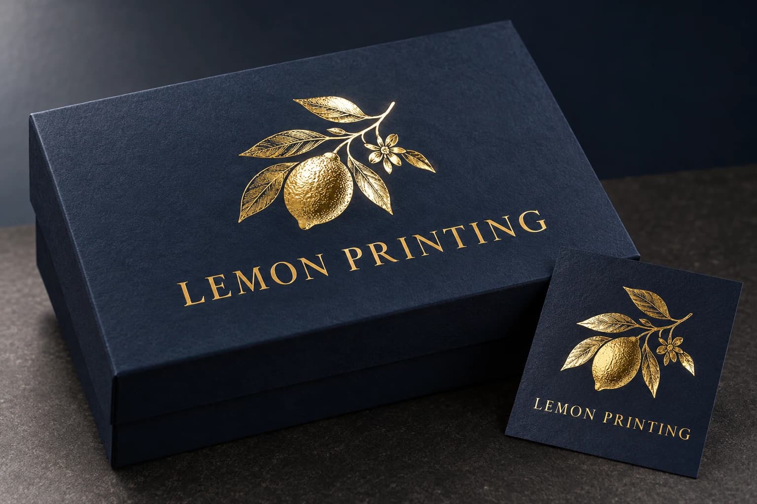
1 / 3 — Gold-foil Lemon Printing title on a navy hardcover. Illustrative, not an actual order or performance test.
06 / Metallic
Silver foil stamping
Cool, crisp metallic detail
Silver foil adds a cool metallic reflection to type and graphic detail. It is transferred foil, not gray ink, and its brightness changes with the surface, foil grade and lighting.
- How it works
- Hot stamping transfers a silver decorative layer with a die, heat and pressure. Confirm a flat or combined relief construction rather than assuming foil creates raised lettering.
- Where it fits
- Contemporary book covers, premium cards and restrained packaging identities.
- What to check
- Large solids and delicate type need different transfer checks. Verify coverage, stock texture, compatibility with lamination and alignment with adjacent printed details.
- Artwork setup
- Provide an independent vector silver-foil layer with outlined text. Name the selected foil reference and confirm clearances and fine-detail limits with the actual construction.
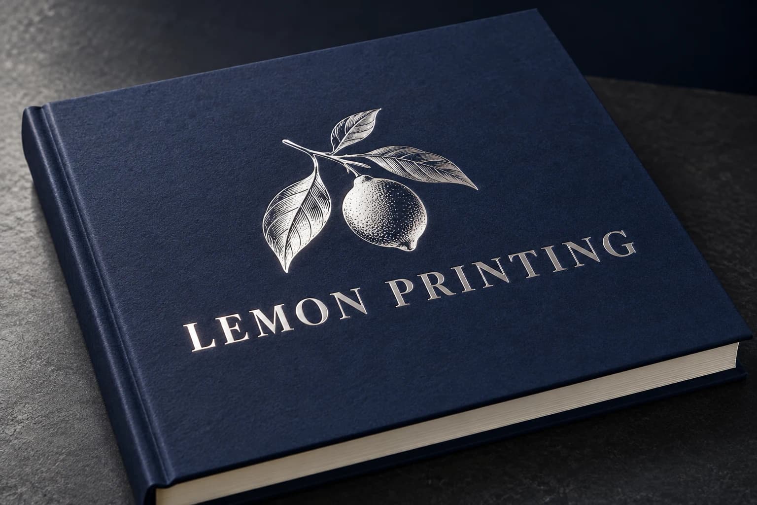
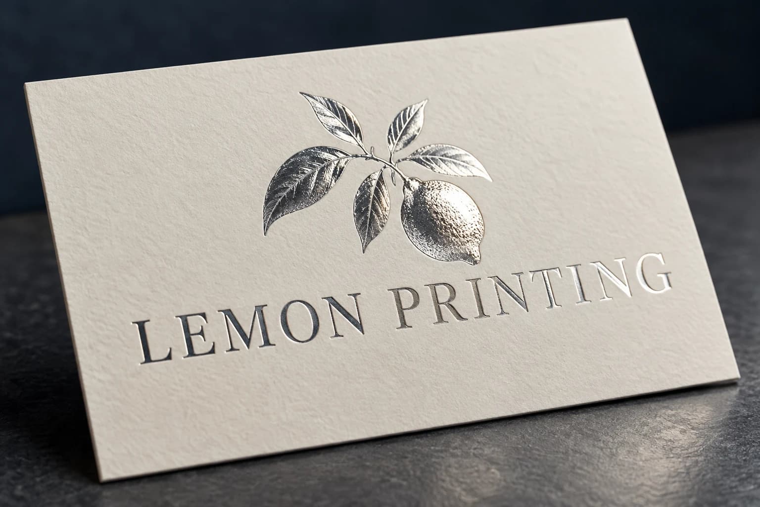
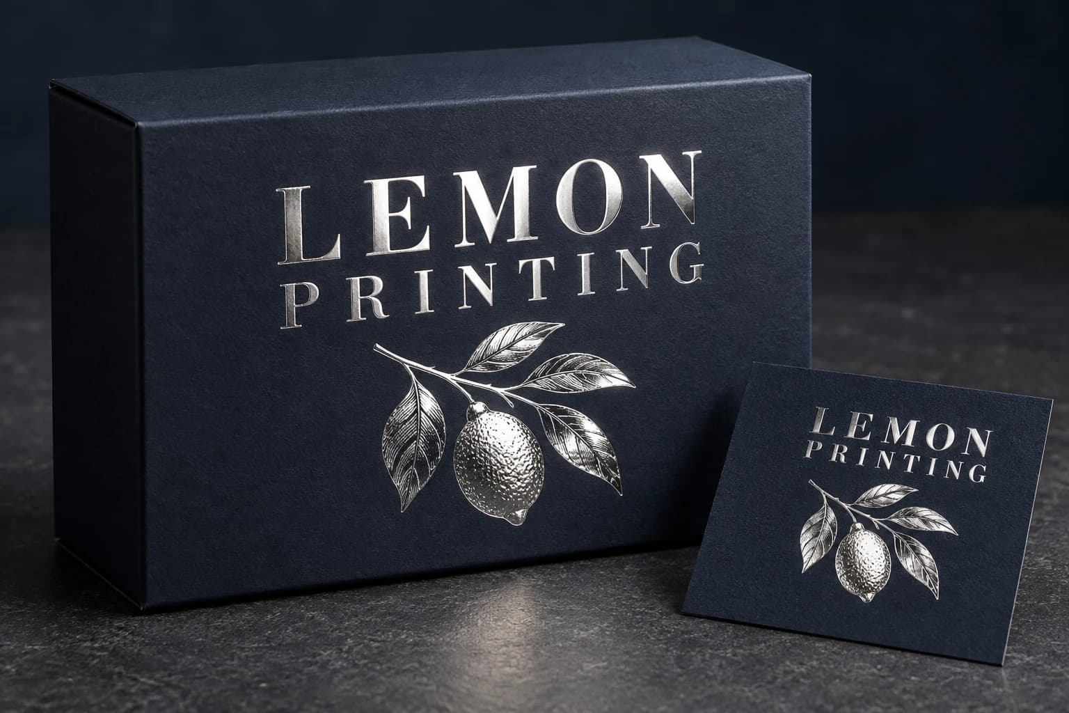
1 / 3 — Silver-foil lettering on a navy printed book cover. Illustrative, not an actual order or performance test.
07 / Contrast
Spot UV
Gloss exactly where you want it
A selective clear UV-cured coating creates glossy areas against a quieter background. A logo or pattern appears as light moves across the surface; it does not create metallic color.
- How it works
- Apply and UV-cure a clear coating in selected areas. Conventional spot UV and high-build raised UV are different specifications; confirm the required coating profile.
- Where it fits
- Book jackets, cards and cartons with a focal logo, title or tonal pattern.
- What to check
- Poor registration can create a visible halo. Verify coating adhesion, fine detail and compatibility with the base film; avoid critical folds unless the finishing route has been checked.
- Artwork setup
- Provide a solid vector mask aligned to the print file, clearly named SPOT UV. Keep it separate from CMYK artwork and identify any knockout or registration requirements.
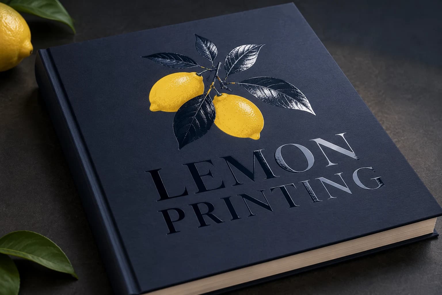
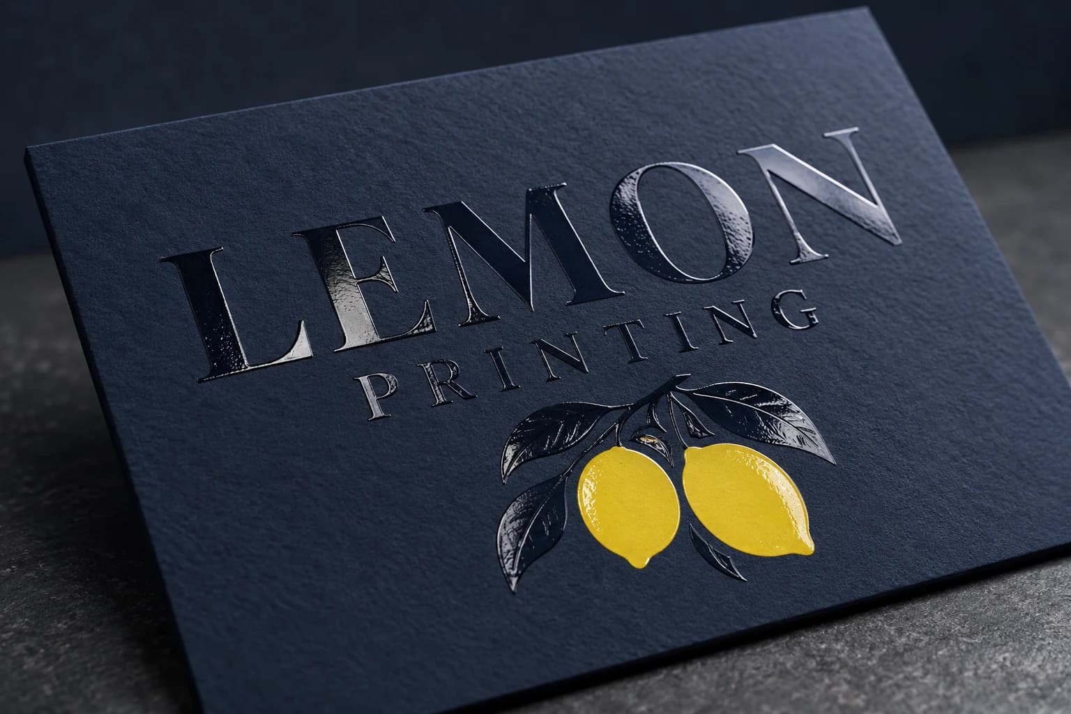
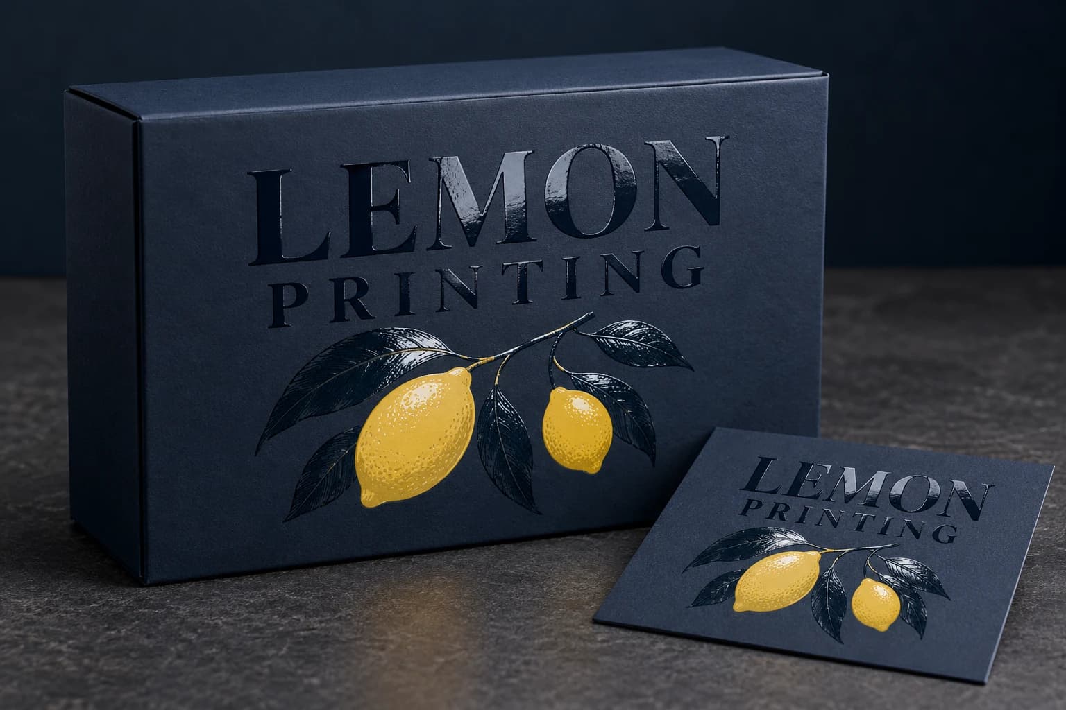
1 / 3 — Clear spot UV Lemon Printing logo on a matte navy cover. Illustrative, not an actual order or performance test.
08 / Relief
Embossing
Raise the paper, not the ink
Embossing raises a selected design above the surrounding surface. Blind embossing uses the material’s own color; light and shadow reveal the shape without needing foil or printed contrast.
- How it works
- Matched tooling and pressure shape the paper into raised relief. Stock thickness, fiber behavior and tooling determine how sharply the design can be formed.
- Where it fits
- Tactile brand marks, stationery, cover details and packaging panels.
- What to check
- Relief can affect the reverse side. Fine lines, thin stock and nearby folds may distort or crack; approve the depth and edge definition on the actual material.
- Artwork setup
- Supply vector relief artwork and identify raised areas. Separate blind embossing from registered print or foil; confirm stock, reverse-side appearance and tooling clearances.
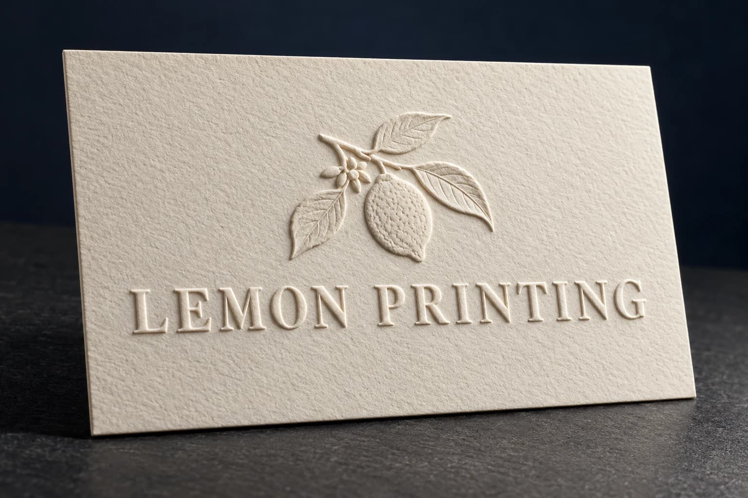
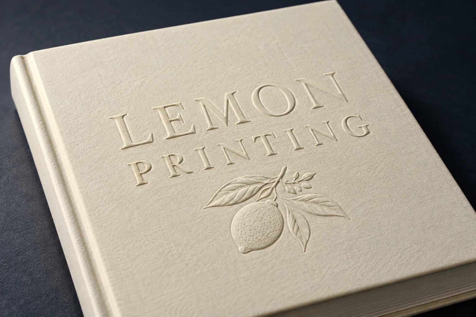
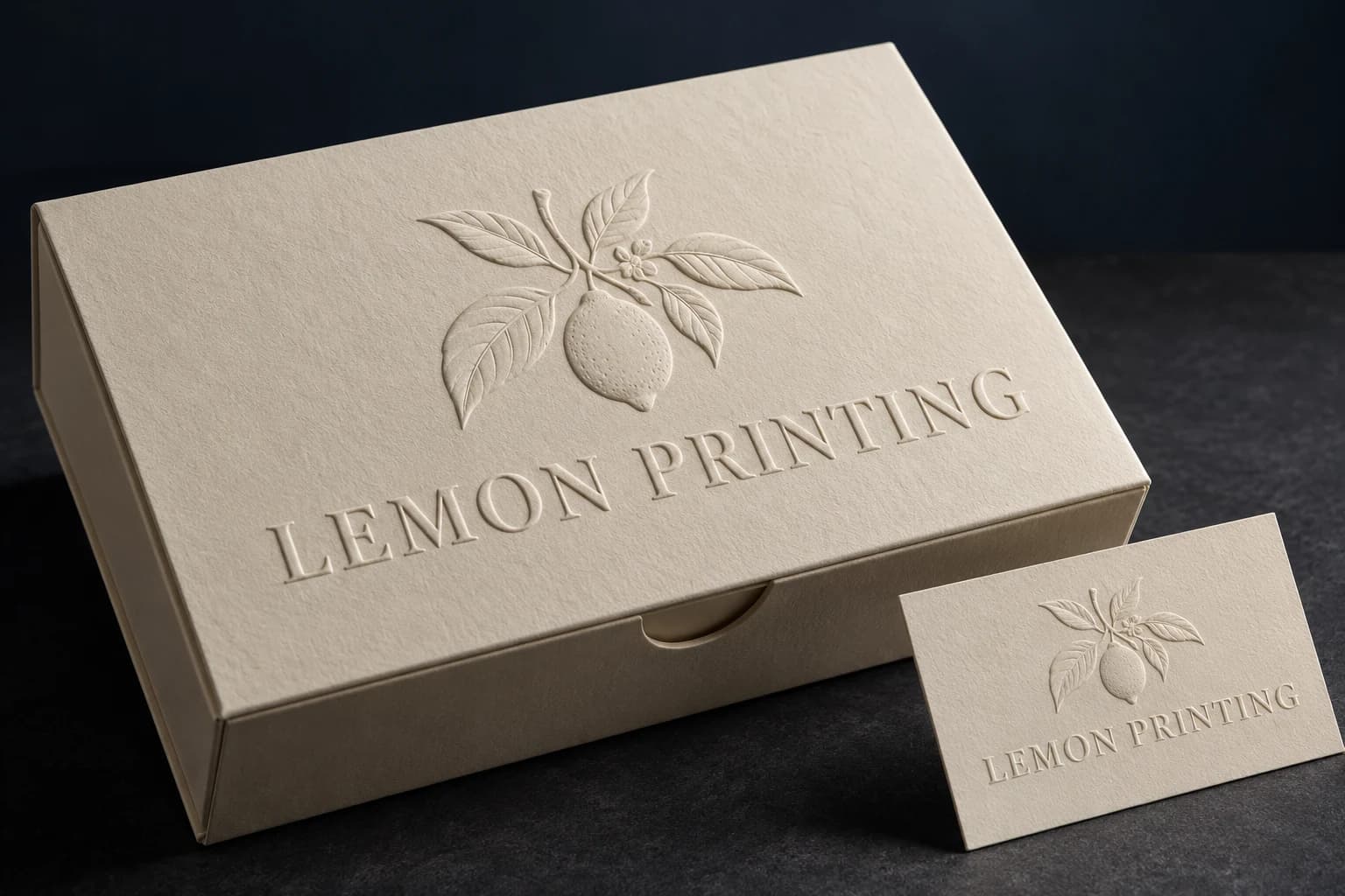
1 / 3 — Blind-embossed raised Lemon Printing lettering on ivory paper. Illustrative, not an actual order or performance test.
09 / Relief
Debossing
Press a detail into the surface
Debossing presses a design below the surrounding surface. The recessed impression gives a quiet tactile effect; adding ink or foil is a separate design and production choice.
- How it works
- A die presses the specified artwork into a suitable stock or cover material. The construction and tooling control the achievable depth and definition.
- Where it fits
- Understated cover titles, premium paper cards and packaging brand details.
- What to check
- Deep impressions can show through, weaken the material or blur delicate detail. Review the reverse side and verify the actual stock rather than specifying an arbitrary depth.
- Artwork setup
- Provide a separate vector layer identifying recessed areas. Confirm whether the impression is blind, printed or foil-registered, with suitable clearance from folds and binding.
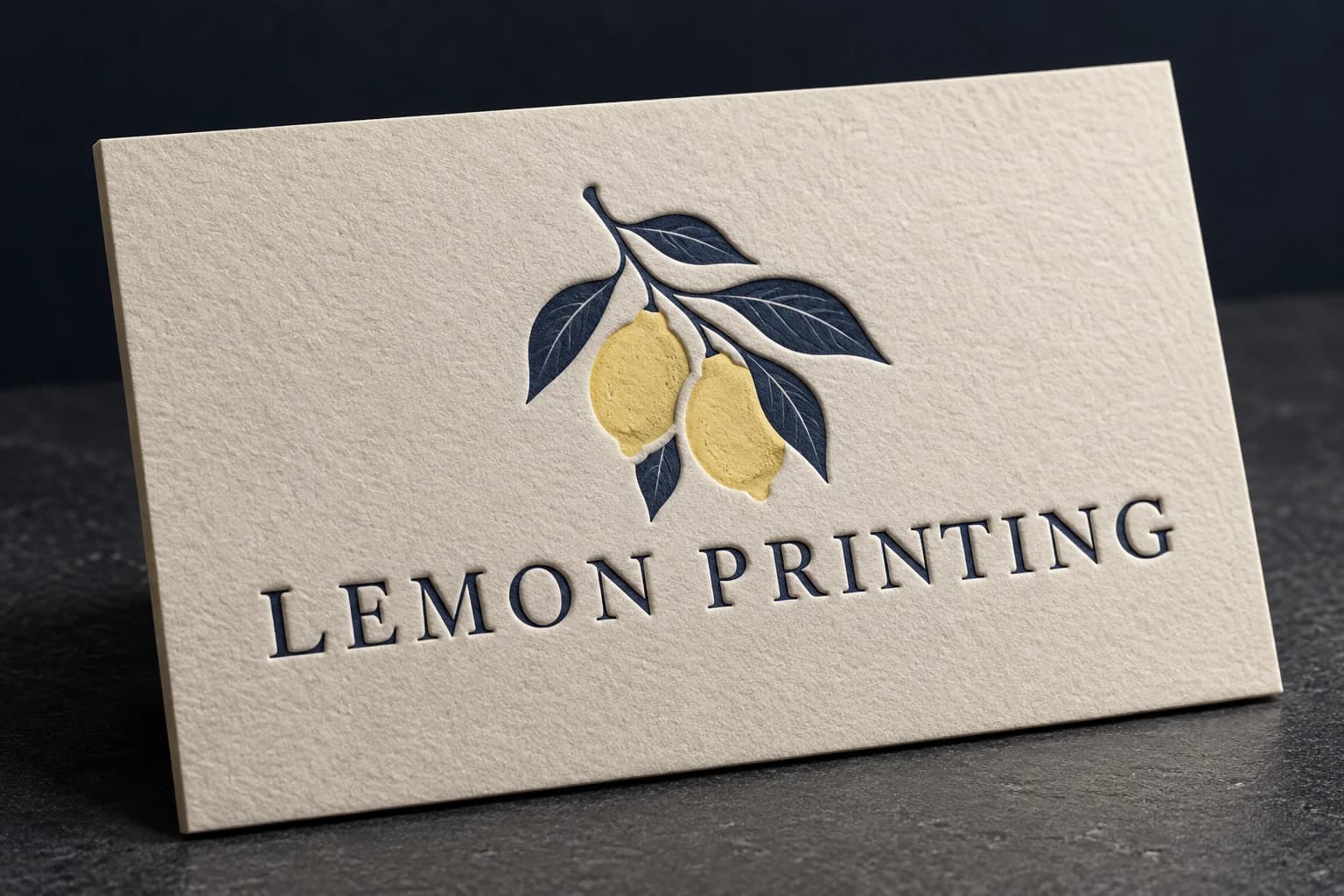
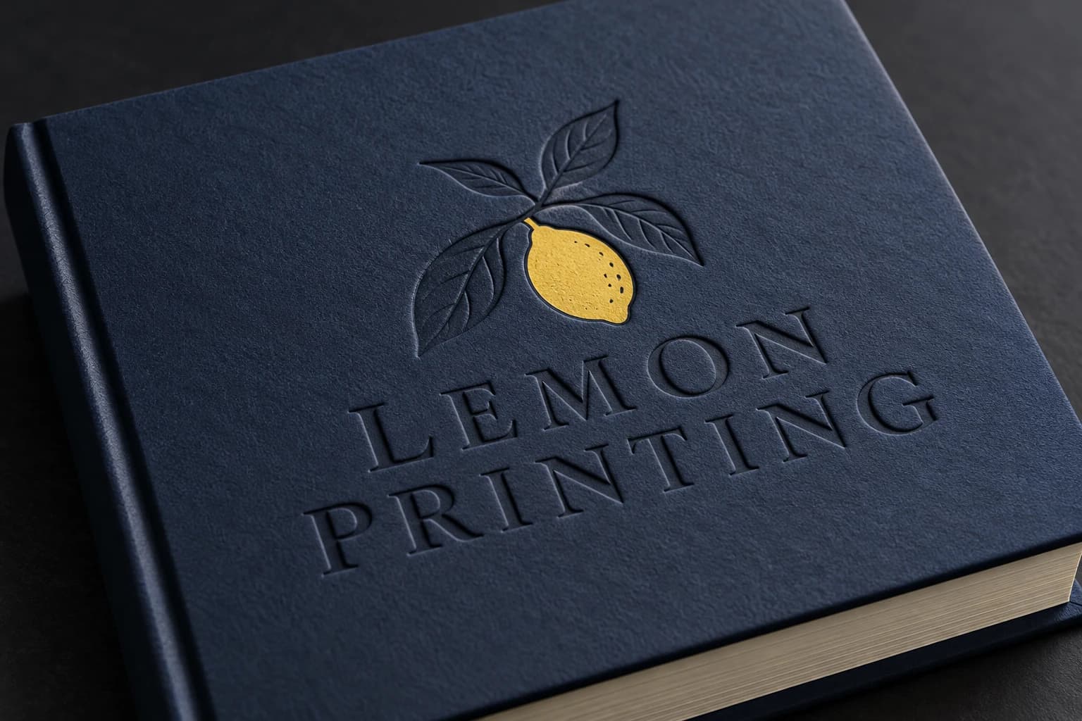
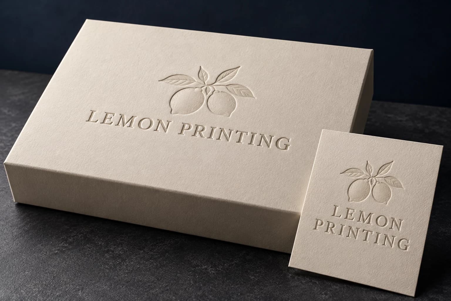
1 / 3 — Ink-registered debossed Lemon Printing lettering on ivory card. Illustrative, not an actual order or performance test.
Make a useful comparison
Start with what the surface must do.
A finish is a design and production choice, not a universal quality upgrade. Compare the finished combination of stock, print and surface treatment.
| Your priority | Start by comparing | Approval focus |
|---|---|---|
| Paper feel or writable space | No added treatment on an appropriate stock | Ink rub, pen behavior and stock texture |
| Overall surface reflection | Varnish, gloss film or matte film | Finished color, glare, folds and adhesion |
| Metallic brand detail | Gold or silver foil | Foil reference, transfer and registration |
| Selective gloss contrast | Spot UV against a compatible matte base | Mask alignment and coating adhesion |
| Tactile shape | Embossing or debossing | Relief definition, stock and reverse side |
Surface finishing FAQs
What is the difference between varnish and lamination?
Varnish or coating is applied as a liquid and dried or cured. Lamination bonds a separate film to the printed sheet. Both change appearance, but their touch, adhesion, fold behavior and handling performance depend on the chosen material and process.
Can foil, spot UV and embossing be combined?
They can be combined on suitable constructions, but the order of operations and compatibility must be checked. Send separate finish layers and identify the final stock or laminate. Use a representative sample to approve registration and surface adhesion.
Does matte lamination prevent scratches?
Standard matte film does not automatically provide anti-scuff performance. Dark coverage can make rubbing more visible. Specify the handling conditions and compare a suitable film grade on a finished sample.
Can a digital proof show the final finishing effect?
A digital proof can show placement, text and print color intent, but cannot reproduce metallic reflection, tactile relief or the feel of a film. Use artwork approval together with a relevant finish swatch or constructed sample.
How should I prepare artwork for foil, spot UV or relief?
Supply separate, clearly named vector layers at final size, aligned with the print artwork. Outline text and use solid shapes. Confirm minimum detail, registration allowances and clearance from folds, trim, hinges and glue areas for the actual production route.
What should I send for a finishing quote?
Send the product, quantity, dimensions, stock or construction, printed sides, finish coverage and destination. Include separate finish artwork where available, and explain what the sample needs to verify. Tooling and setup depend on the design and process.
Make the finish part of the specification.
Send the product, stock, quantity and finish artwork. Tell us what matters most—reflection, surface feel, registration or relief—so the quote and sample check address the same goal.